8 Ways To Nail Your Cart Abandonment Emails
- 10th April 2019
- Ecommerce , Online Marketing
- 0 comments

Statistics show that 75% of shoppers will leave your eCommerce store with items still in their shopping cart.
That’s a lot of potential sales lost.
Cart abandonment is an uphill struggle that thousands of retail marketers around the world have to deal with on a daily basis. And while you can’t persuade all cart-abandoners to complete the checkout – you can strategically persuade them to return.
If your marketing skills are up to scratch, you may already have cart abandonment emails in place. But that’s no reason to relax, as they should be regularly tweaked to optimise their performance.
Putting in the effort to turn those hesitant customers into star buyers could increase your sales ten-fold. Follow along with these 8 simple steps to improve your cart abandonment emails.
What is eCommerce Cart Abandonment?
The term is used in eCommerce, and it’s when a customer shopping online adds item(s) to their cart and exits the website without completing the purchase. A high cart abandonment rate is a clear indication that something is preventing customers from completing the purchase. There can be many reasons for it, such as high shipping rates, lack of trust badges or hidden taxes.
If you’re the owner of an eCommerce store and want to help prevent your customer from packing their bags and leaving empty handed – I’d advise you to continue reading.
1. Time & Frequency Matters
Research conducted by Sale Cycle found that sending your cart abandonment email within 1 hour of the customer abandoning their basket produces the best response.
Emails sent within 1 hour had a conversion rate of 6.3%, while emails sent after 1 hour had a conversion rate of 4.3%. Waiting for more than 24 hours has a measly 1.7% conversion rate.
The key is to keep the shopper interested in the product. Sending your email within 1 hour will increase your chances of catching the shopper while they are still browsing online. Leave it too long and the customer could lose the urge to make a purchase.
While timing is essential, frequency proves to be important too.
On average, companies that send a series of 3 cart abandonment emails have 62% more orders than those that send one email.
The strategy is as follows:

Avoid sending any more than 3 cart emails as you run the risk of being flagged as junk mail. Furthermore, there’s a chance that the shopper will unsubscribe if you’re bombarding them with emails trying to sell them products.
2. Display the Abandoned Product(s) In your Email
It sounds obvious, I know – but you’d be surprised.
Ideally, your abandonment email should contain an eye-catching subject line, an image of the product, a link for the shopper to view their cart, and an offering of customer support.
Images are crucial in catching the attention of the shopper immediately. Without images, your email could go unnoticed.
What’s more, you could miss out on the opportunity to cross-sell similar products. Here’s an excellent example by Kate Spade of a cart abandonment email with good use of cross-selling.
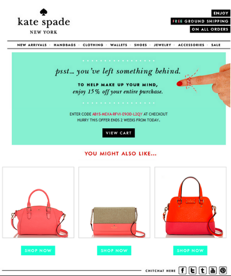
Reminding your customers of what they are missing out on can help to encourage a sale. It’s possible that after some time away from your store, the shopper has forgotten the items they had to their basket.
More importantly, the abandonment may have been accidental or due to a technical issue. For example, during a busy sales period such as Black Friday, websites can crash due to an increase in web traffic. This is why including support information and contact info is crucial for customer support.
3. Use High-Converting Subject Lines
A sleek and well thought out subject line is potentially the most important thing. It’s the first thing that the shopper will see, so you have to impress.
It helps to get creative with your emails, so don’t be afraid to incorporate humour if it suits your brand. Generally speaking, subject lines that sound human work well.
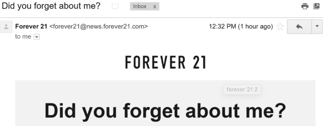
Short and sweet is the approach you should take. In fact, this also applies to the text in the body of the email. It’s important that you don’t leave the customer confused by reading long paragraphs of text.
To give you an indication of what a good subject line looks like, here are 3 examples of the ones most commonly used:
- #1 abandoned cart subject line: “Don’t miss out!”
- #2 abandoned cart subject line: “Empty your cart with XX% off.”
- #3 abandoned cart subject line: “Your cart is about to expire.”
As you can see, short, sweet, and straight to the point. It’s important that you make the shopper aware of their abandoned cart.
When it comes to writing the subject line for your email, think about your target audience and the sort of relationship you have with your customers. If your emails are usually light and playful, you should incorporate elements of this to your subject line.
You should also try to include discounts or other incentives like free shipping in your subject line.
4. Offer Discounts or Free Shipping
A whopping 56% of people abandon their shopping cart because of unexpected charges.
Regardless of how common shipping charges are nowadays – people still object to paying them. Offering free shipping to customers who leave your website empty-handed is an incentive for them to return and complete their purchase.
According to Walker Sands Future of Retail Study, nine out of ten shoppers said that free shipping was the number one incentive when asked what would encourage them to shop online more often.
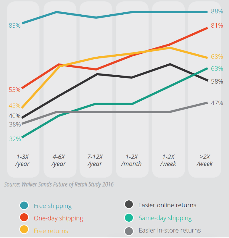
If your business provides free shipping on all products, consider offering a small discount of 10 or 15 percent to shoppers who abandon their cart.
And remember, use the subject line to show off the percentage that you’re offering, as this will encourage the shopper to open the email.
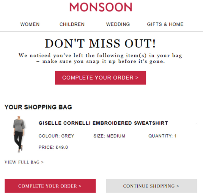
5. Use Prominent CTA Buttons
The purpose of the email is simple: direct the shopper back to their basket. So, when creating your CTA button, use a similar thought process and make your CTA button irresistible.
A bold and bright call-to-action (CTA) button is essential to any cart abandonment email. It should be attractive, easy-to-see, and positioned somewhere near the centre of the screen for maximum impact.
Use phrases such as “Continue shopping” or “Buy now” to motivate the customer to click on it.
Some eCommerce stores add more than one CTA button. This can encourage the customer to add more products to their basket before checking out.
6. Personalise Your Abandonment Emails
An abandonment email is pointless unless personalized. Giving your customers a feeling that you know what they want may encourage them to complete the purchase. A good way of doing this is by recommending products they have previously searched for.
As well as the obvious, think outside the box.
For example, if a customer has a pair of trainers in their shopping cart, you could recommend a pair of socks or an item that compliments what’s already in the basket. By going the extra mile, you are increasing your chances of making a sale.
The tone you use in your email will determine how the customer reacts. Generally speaking, abandonment emails are there to serve as a gentle reminder. Therefore, avoid sounding like a sleazy salesperson that’s desperate for a sale.
Using phrases like “Don’t leave us hanging” or “There’s something in your shopping cart” creates a pleasant vibe. If the customer feels as though you are following up in a genuine way, they’ll be more inclined to complete the purchase.
Another tip for creating an engaging abandonment email is to use the various stages of the customer life cycle to your aid.
For example, if you notice a repeat customer abandons their shopping cart several times, rather than sending a friendly reminder, you could ask them if they faced any technical issues during checkout.
Ah, mobile – how did I forget?
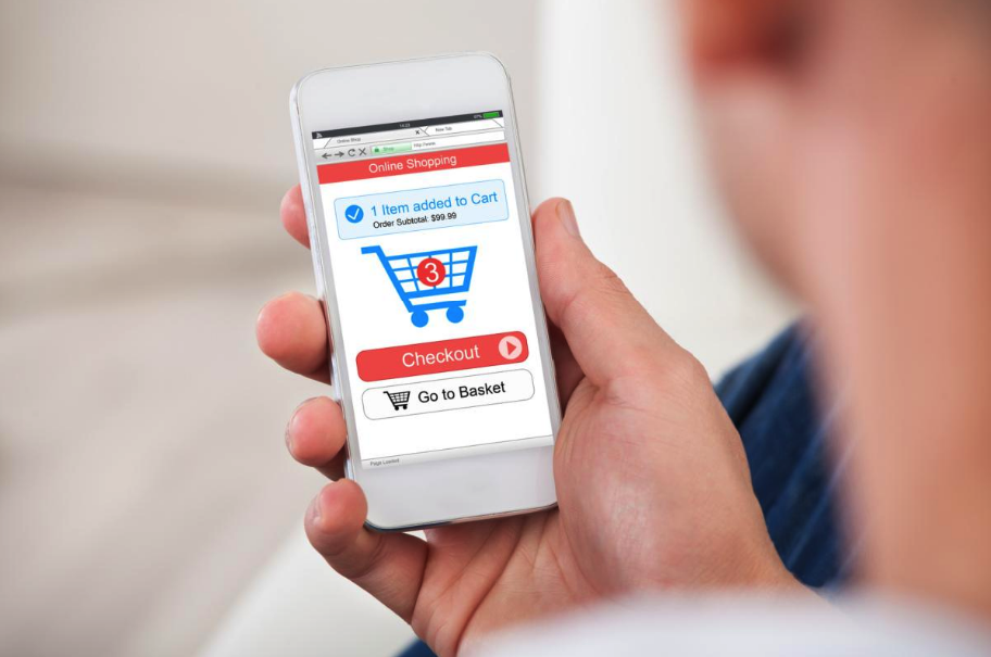
With the rate of people starting purchases on their desktop and completing them on a mobile-device increasing to over 259 per cent in 2018, it’s vital that customers have a seamless cross-platform experience.
To ensure that this is the case, keep your emails simple with a straightforward layout. A prominent CTA button will make it easier for the shopper to complete their purchase on smaller devices.
7. Customer Support is Key
Companies who exclude customer support or helpful guides from their cart abandonment emails are missing a trick. Offering a small dose of support at the right time can help regain the customer’s trust. Don’t forget, some customers may have experienced technical issues prior to purchase which forced them to abandon their cart.
Think about adding the following to your emails:
- Guide them through the purchase with on-screen instructions
- Offer live chat support so that shoppers can talk to a real person about their problems
- Provide FAQs
Believe it or not, 30% of customers expect companies to have a live chat feature on their website. Research shows that live chat also encourages repeat visitors and can boost the average order value.
The bottom line is that many shoppers abandon their cart because they can’t get questions answered about the products, policies, or payments. Giving the customer ample opportunity to connect with your team during checkout can prevent them from abandoning their basket.
8. Examples of Cart Abandonment Emails
To give you a clear idea of what’s good and what’s not so good, let’s take a look at some examples of cart abandonment emails. I’ll highlight the pros and cons of each one.
#1 You left items in your cart by FiftyThree
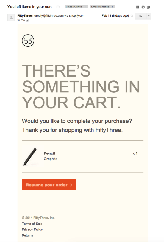
Pros
- Big, bold, catchy headline
- Good use of humour
- The copy is short and sweet
- The abandoned product is displayed clearly
- The CTA catches your attention immediately
Cons
- No customer support link
- No discount on offer
#2 You want to make a deal? By NOMAD
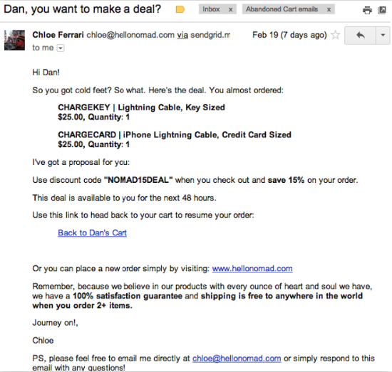
Pros
- Strong use of the shopper’s name in the subject line
- Good casual humour throughout the copy
- Customer support options
- Discount code
Cons
- Lack of creativity and colour in the design
- No image of the items left behind
- CTA button is small
- While they have offered customer support, the links could be a little more inventive
- Email is very text-heavy
Out of the two examples, it’s clear to see that a good use of images and colour are crucial in attracting the attention of the shopper. While NOMAD includes a discount code and customer support options, they’re harder to identify in the wall of text.
Conclusion
Landing on a strategy to avoid the inevitable scenario of cart abandonment can be challenging. As well as being high conversion-centric, they should be personal with a human touch. These methods mentioned in this blog post should help with your timing, copy, design, and what to include in your cart abandonment emails.
When creating the design and drafting the copy for your cart emails, put yourself in the shopper’s shoes and ask yourself these questions.
Would this email make me complete a purchase? Do I find this CTA button irresistible? If the answer is no, then why would your customers think otherwise.
What sort of tactics do you use in your cart abandonment emails? Let me know in the comments below.
Author

Steven Wu
Steven has been working in the eCommerce market for over 8 years. Specialising in Magento eCommerce development and has a passion for Wordpress. Has worked with clients such as HTC, Cisco, Hitachi, BT, Panasonic, HSBC and Natwest. Steven enjoys reading and rock climbing at the weekends.


